

The brand logo plays a crucial role in a brand's identity. The logo is essential and must convey the correct and complete message to those who receive and use VGAMES's brand identity.
Brand name
“VGAMES” was chosen as the name to mark the milestone in brand recognition.
VGAMES
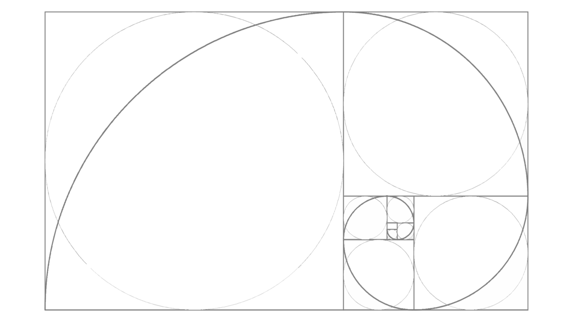
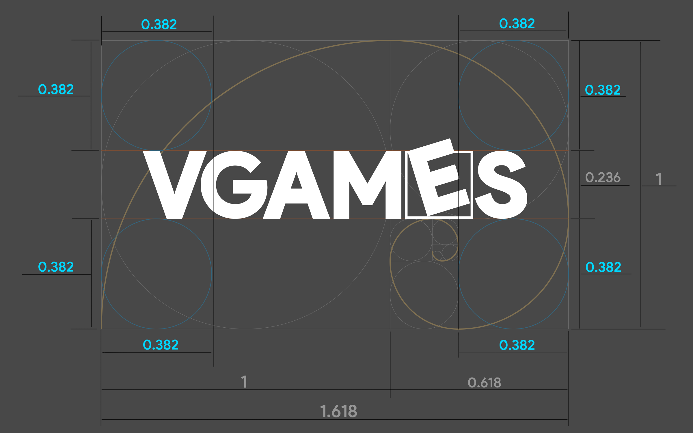
The golden ratio – a standard model in art and design – has been very popular for a long time.
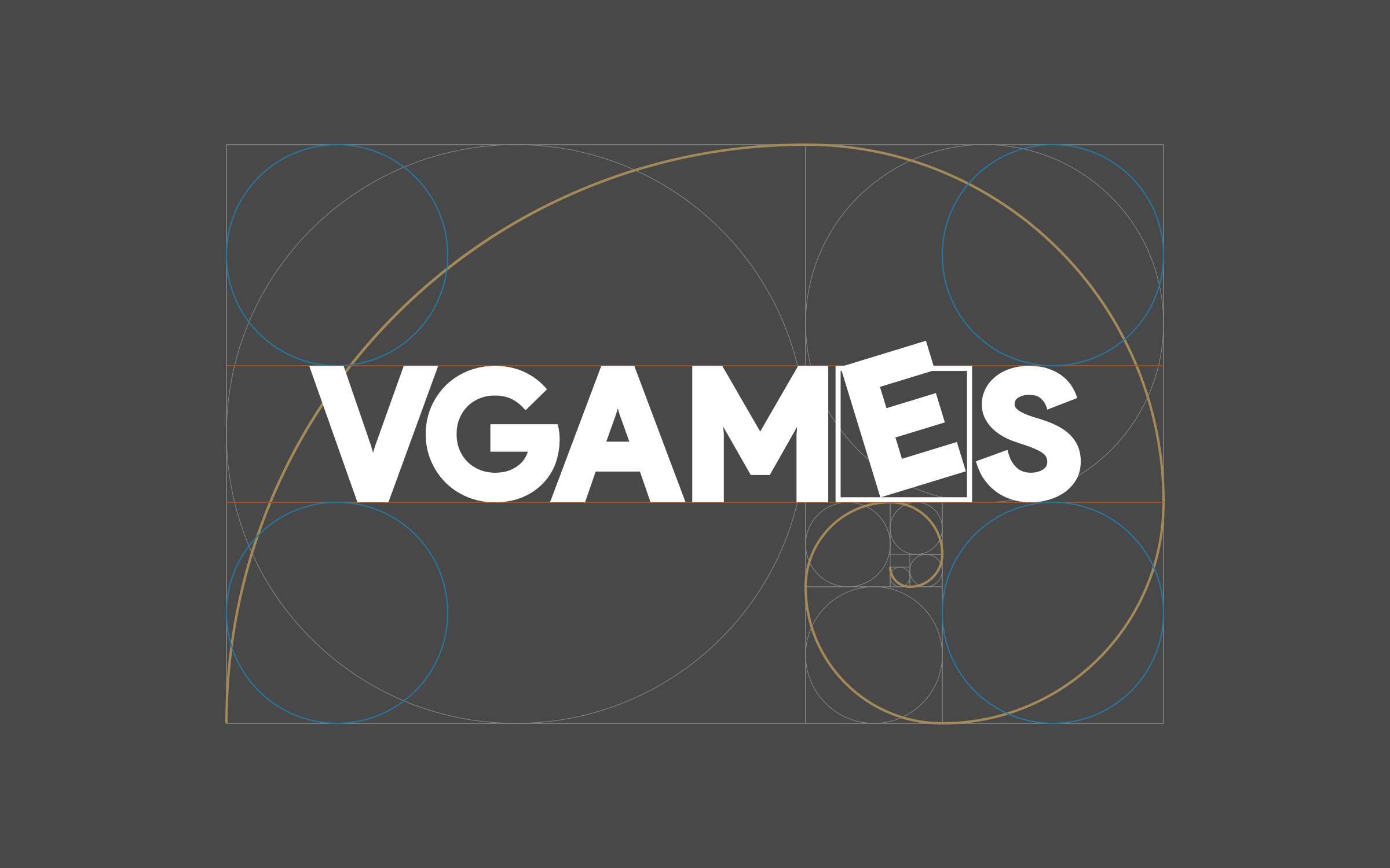
With the proven solidity of the Golden Ratio used by designers, the brand logo was created based on that foundation. The VGAMES logo is a combination of these principles, placed right at the center of the Golden Ratio, stable and captivating!
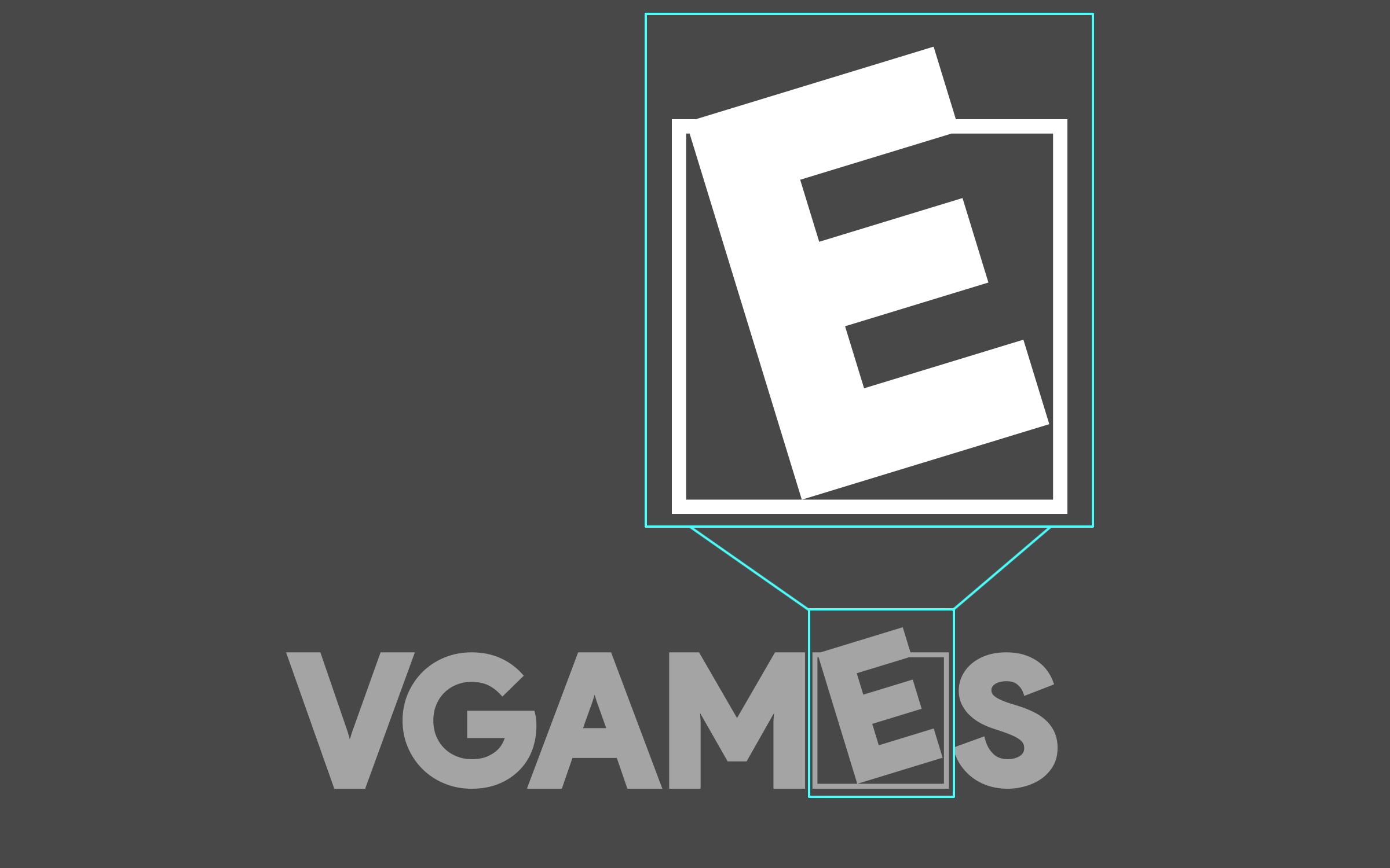
The stylized letter “E” in the VGAMES logo is intended to create an unforgettable highlight, clearly reflecting the logo's spirit of “For Every One” and “Think Out Of The Box”.
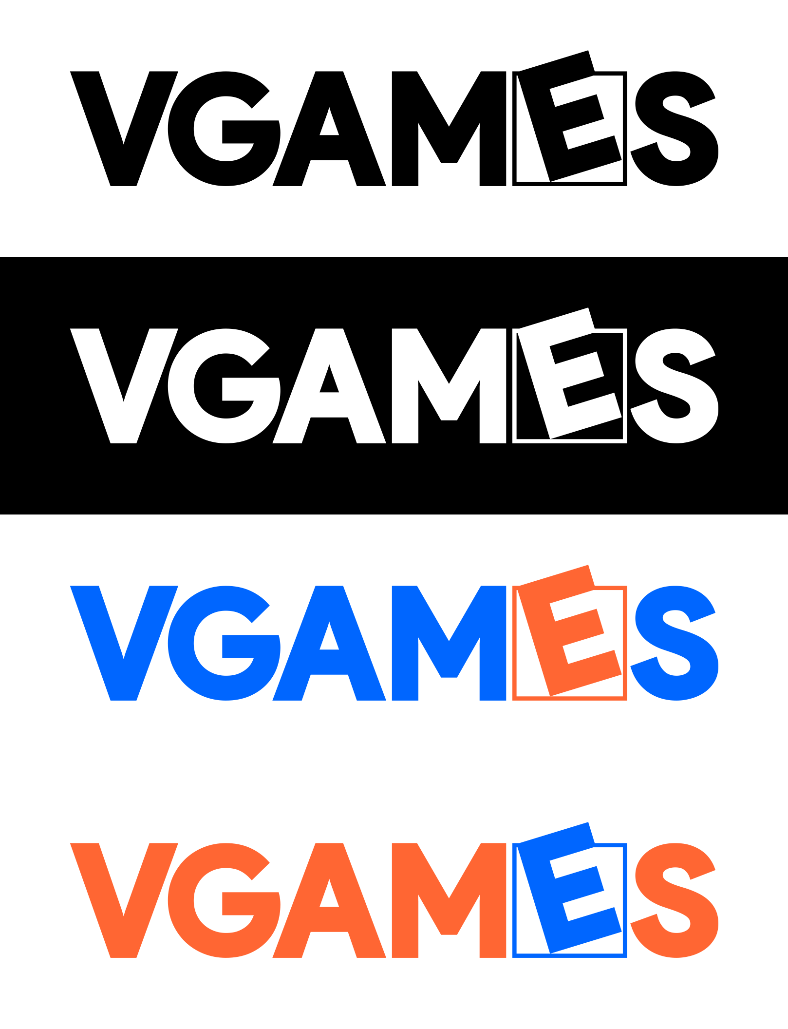
Icon ratio (1:1 ratio)
The standard proportions of the symbols are always based on the Golden Ratio, ensuring that the symbols are used correctly.
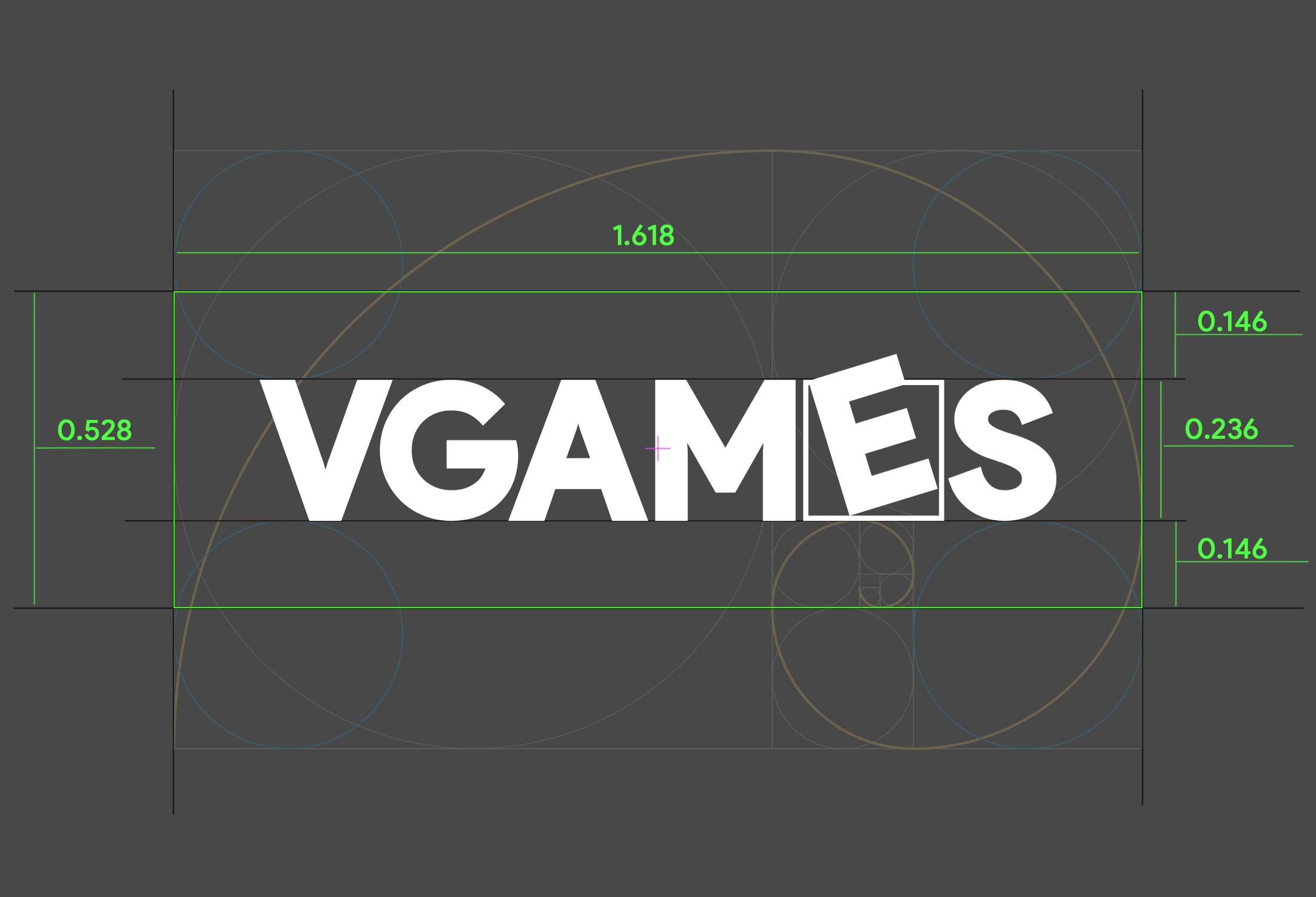
Safe space
To maintain the integrity and aesthetic impact of the VGAMES Icon, always maintain clear white space around it. Clear space around the Icon is an integral part of the design and ensures the Icon can be seen quickly, clearly, and not obscured by other images, icons, or text.
Minimum size
To ensure the VGAMES icon is displayed clearly, please adhere to the minimum icon size.

56 mm wide (print) 160 px wide (digital)
To ensure that the VGAMES icon is always used correctly, please follow these guidelines:
Do not drag the Icon

Do not change the proportions of the Icon's components.

Do not tilt the Symbol

No Shadow Cast

Do not change the Icon's color without permission.

Do not place the icon on a complex background.

Do not place the icon on a low-contrast background.
The size of the logo when placed alongside other partners will largely depend on the importance of the relationship, but it should be the same size if possible.
